Device Specific:
Smart Subscribe Plugin allows you to dictate which buttons your website visitors see depending on their device. Don’t waste time, space, or confuse website visitors by displaying buttons that aren’t relevant to them. If someone visits your website on an Android device select buttons that lead to apps that are available on Android.
During the initial product development phase it became evident that there is plenty of confusion around subscription buttons. As podcasters we know what apps work on all the various devices because we are in the podcasting space. However, put yourself in the shoes of someone who is not as tech-savvy as you might be. Imagine being faced with as many as ten buttons and trying to figure out which one will allow you to receive podcast episodes automatically on your device. We found that many people believe podcasting is tied solely to Apple Podcasts. I even had Android owners ask me how they could get Apple Podcasts on their Android device.
When it comes to displaying subscription buttons less is more. With much of the world still not aboard the podcasting train, make sure you are turning website visitors into subscribers.
Total Control:
One of the main issues I see with subscription buttons is bad formatting. Nothing drives me crazier than having poorly formatted buttons. If you take a quick trip around the internet you will quickly see button format issues. Heck, even the initial version of Smart Subscribe Plugin suffered from this annoying problem. That’s why I made sure there was a way to dictate how many buttons could be fit on a row.
Here’s a scenario you will likely see around the web: Lets say the area for your buttons can fit 4 buttons across and you choose to enable 6 buttons. What happens is you will display 4 buttons on the first row and the remaining 2 buttons on the second row. This looks poorly structured and unprofessional. With Smart Subscribe Plugin you simply alter this in the shortcode by changing the (cols=””) number variable as shown below:
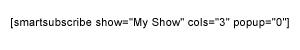
In this instance the 3 represents that I want 3 buttons per line. If you wanted to display all the buttons in one row, simply leave the default setting of cols=”0″. It’s that simple!
No HTML knowledge needed.
Optional Pop-up:
Pop-ups have been utilized for about as long as the internet has been around because they work! Pop-ups are an effective way to get website visitors to see exactly what you want them to see. For years marketers have been aggressive when it comes to capturing email addresses. Why not apply that same tenacity to help obtain new podcast subscribers?
The pop-up is enabled by default.
*To turn off the pop-up simply delete the (popup=”0″) section like the following example:
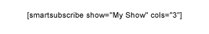
The 0 represents that the pop-up will appear to each website visitor every time they load a page, or post, your shortcode appears on. The number “1” would represent the pop-up appearing to each website visitor once per day, “2” would represent every two days, 7 would represent every seven days, so on and so forth.
Color Picker:
There’s nothing worse than finding a brand new theme that has all the bells and whistles but doesn’t match your buttons. That’s why I included a built in color picker. The next time you change your theme you can quickly acquire the hex code color of your theme and drop it into the color picker or simply eyeball it using the color slider (e.g. the hex code for black is #000000).
A color picker might not sound like something that you should get excited about until you have to change 10 buttons in an image editor, re-upload them to your website, and change all the corresponding URL’s in your posts and pages. With Smart Subscribe Plugin the color change takes place automatically after you save your new color on the settings page.
3 Button Sizes:
Button size is another issue that most of us take for granted. Not having the correct button size for your website can be annoying. The button size you choose in the settings area applies to every shortcode you place on your website unless you override it with the size=”X” setting. Some people prefer using large buttons because they only want to display two or three on their site. Other people may want to display more buttons so they might prefer to use small or medium sized icons in order to keep all the buttons on one row. No matter how many buttons you want to display (or which size you prefer) the choice is yours.
With the size=”X” setting you can now have different sized buttons on the same post or page.
All the buttons are in the SVG format and scale beautifully when zoomed in on mobile devices. Zoom in on the buttons below to see.
(THE BUTTON SIZES ARE SHOWN BELOW WITHOUT LINKS TO A PODCAST)
Large Buttons
LARGE= 90×90
MEDIUM=60×60
SMALL= 30×30
Available Buttons:
Currently there are fourteen buttons included: Apple Podcasts, Google Podcasts, Pandora, Subscribe on Android, Subscribe by Email, Spotify, Stitcher, TuneIn, iHeartRadio, RSS, Spreaker, Deezer, SoundCloud, and an Archive button. Remember, when it comes to buttons less is more.